

“How will my website work on mobile?” is one of the most common questions a digital agency will hear when discussing websites with prospective clients.
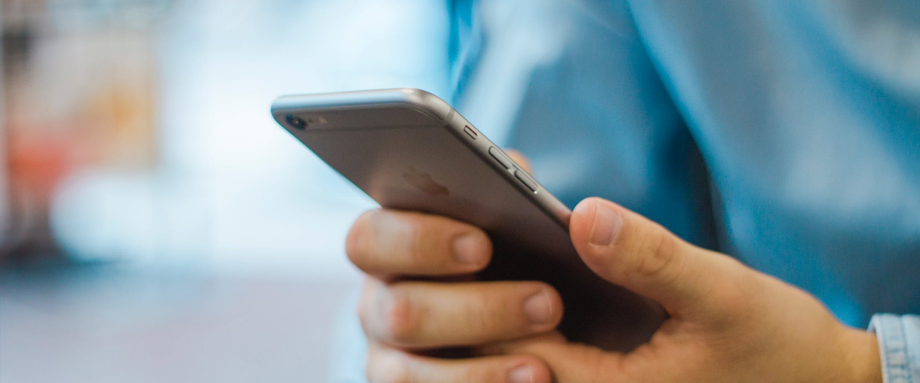
Approximately 95% of adults were using a mobile phone in 2019. Of all website traffic, more than 50% of that comes from a mobile device and so how your website will work on mobile is something you should be considering as part of your company’s online strategy.
What Is Mobile Responsiveness?
Mobile responsiveness refers to if your website is optimised, functional, aesthetically pleasing on a range of different devices. As technology has advanced there is a multitude of devices available for purchase. Many of these devices have different screen sizes, and so it is increasingly important to ensure your company website is mobile responsive to ensure functionality and aesthetics are maintained across each device.
Why Is Mobile Responsiveness Important?
Historically people viewed websites on a desktop. In more recent times there has been a shift away from this trend and towards alternative devices such as smartphones. More than 50% of all website traffic coming from a mobile device according to Google. Considering the volume of people using mobile devices a mobile responsiveness site should be a part of your online strategy. The more accessible your website is to all device and browser users, the more chance you have to generate an increase in leads, conversions, and sales.
How to get the most from mobile responsiveness?
We have already established that a mobile responsive website is a must-have in 2021, however how exactly do you get the most from it. Think of it this way, when you are browsing websites online what enhances your mobile browsing experience. Consider what features make your online browsing experience five stars. Some features to consider include:
- Breadcrumbs enhancing the customer journey between pages as seamless as possible,
- Quick Buy allows you to add items to the cart without having to navigate to an individual product page,
- Social Media Checkout giving you the ability to checkout with your Facebook or Instagram Account.
It is evident that the digital age is continuing to grow, and people are increasingly using mobile devices to browse the internet. Given this mobile responsiveness is something you should consider when developing your online presence.
Does your website need a redesign to include mobile responsiveness? Contact Us on Dungannon 028 3754 9025 or Belfast 028 9002 5050.


